A $400,000 first-time buyer and a $4,000,000 custom home buyer are not reading the same website even when the pages are identical. The first wants a process explained, because they have not done this before. The second wants to understand what the agent has handled, how discreetly the transaction will be managed, and who else has trusted them with a comparable home.
Most agent websites try to speak to both. The home page hero promises a warm partnership for first-time buyers. The listing gallery shows a $3,000,000 waterfront. The testimonials mix both tiers without labels. The buyer form is the same for either audience.
That mixed approach is familiar, and it is the reason so many agent sites feel vaguely off to both audiences at once. The question is not which tier is yours. It is whether the site is built for one of them, both of them clearly, or neither.
Two buyers, read differently
The simplest way to see the gap is to put two people in front of the same page and watch what they notice.
The first-time buyer is weighing an unfamiliar transaction. Per the CFPB's definition, this is someone who has not owned a principal residence in the past three years, which means nearly by definition they do not have recent experience with the home buying process. They are reading for reassurance, for explanations, and for signals that the agent is comfortable with questions. They want to see closing costs broken down, financing options in plain language, a timeline, and a path through the process that feels possible.
The luxury buyer has usually transacted before. Often several times. They are reading for evidence: comparable homes handled, a portfolio that shows the agent's work at the price, a sense of the network and resources available, and a professional contact method that respects their time. They do not want a lead-capture form. They want to confirm whether the agent is a credible fit, then reach out directly.
Those are different jobs. A site that does one well tends to be clear and purposeful. A site that tries to do both on every page tends to read as if it is not sure who it is talking to, which is exactly the signal that pushes a careful reader to the next search result.
What a luxury-focused site actually looks like
The best luxury agent sites share a short list of structural choices.
A portfolio of recent sold homes at the price, presented with care. Not teaser listings, not generic inventory, but a set of five to fifteen homes that establish the agent's current working range. Addresses can be omitted or softened for privacy, but prices, periods, and property style should be specific.
A written point of view on the segment of the market the agent serves. Custom waterfront. Heritage homes. Architect-designed contemporary. Whichever niche, the content treats the segment as a specific thing with its own buyer behaviours, not as "luxury" in the generic sense.
A professional contact path. A direct email, a scheduling link, or a per-listing inquiry form, but not a generic "Fill out this form and we will get back to you" with the standard fields. The expectation at the price is that first contact feels personal.
References and third-party validation that are verifiable. Named credentials (CLHMS, Million Dollar Guild), named publications an agent has been quoted in with links to the pieces, and specific past clients who have agreed to be referenced. The generic testimonial carousel does less here than one named and sourced third-party quote.
The visual bar at this tier is also higher. Redfin reported that luxury home sales (the top 5% of homes by price in each metro) grew nearly 7% year over year in 2024, so the segment is distinct and growing, and the sites competing in it are generally well-produced. A site that cannot match that visual bar competes at a disadvantage for the kind of buyer it is trying to reach.
What an entry-level or first-time buyer site looks like
The structural choices for an entry-level or first-time buyer site are different in character but no less specific.
A buyer process page, written clearly, covering the steps from "I am thinking about buying" to "I have the keys." Closing costs by name, financing basics, timing, inspection, and the specific role the agent plays at each step.
A financing or mortgage basics page, written to prepare the buyer for a conversation with a lender rather than to pretend the agent is one. First-time buyer program eligibility in the agent's state or province. Down payment rules. What a pre-approval is and how to get one.
Neighbourhood pages focused on the areas the agent actually sells, with commute, schools, grocery, and current listing price ranges. A buyer at this tier is usually weighing two or three specific areas and needs real local detail to compare them.
A clear, low-friction contact form. At the entry-level, the buyer often is not ready to call. A short form with name, phone, email, and the one specific question they have converts better than the luxury model of "email us directly."
Testimonials from buyers at the same tier, labelled so a visitor can see themselves in the review. A quote from a first-time buyer in the same city is far more useful than a quote from a past luxury client, even if the second is more impressive on paper.
NAR's annual Profile of Home Buyers and Sellers tracks a large first-time buyer segment every year and publishes real statistics on how long they search, where they look, and what they most want from an agent. These numbers can be cited by name and year on the site, which gives a page both credibility and search value that invented statistics never achieve.
The mixed-tier problem, honestly
Most agents work across tiers at least occasionally. The honest question for a website is which tier accounts for the majority of the business, and whether the site is built to match.
A common pattern: the site was built when the agent was starting out and most business was entry-level. The agent grew, started handling mid-market and occasionally luxury homes, and the site slowly accumulated luxury imagery and testimonials without changing the underlying structure. The result is a site that looks aspirational but reads as if it is still talking to a first-time buyer.
A second common pattern: the agent sees luxury as the target business and built a site to reflect that, while the actual majority of transactions are still in the mid-market. Here the site under-serves the business that pays the bills.
Three ways out:
Pick the tier that matches the majority of transactions. Build the main site for that tier, with one or two clearly-labelled pages speaking to the secondary tier. For most agents this is the right answer because it stops asking the site to be two things at once.
Build two separate sites. Appropriate for teams or agents with genuinely distinct businesses at each tier and the content capacity to maintain both. Often more work than the structure is worth.
Build a single site with explicit segmentation. A home page that asks the visitor, in plain language, which journey they are on. Separate buyer paths, separate landing pages, separate forms. Requires honest design work because the paths have to be convincingly distinct through content and structure, beyond a cosmetic colour change.
Google's helpful content guidance treats clarity about who a page is for as a quality signal. A page that reads clearly as "written for a first-time buyer in [city]" tends to rank better on queries that match that intent than a page that tries to speak to everyone.
What the imagery is saying that the copy is not
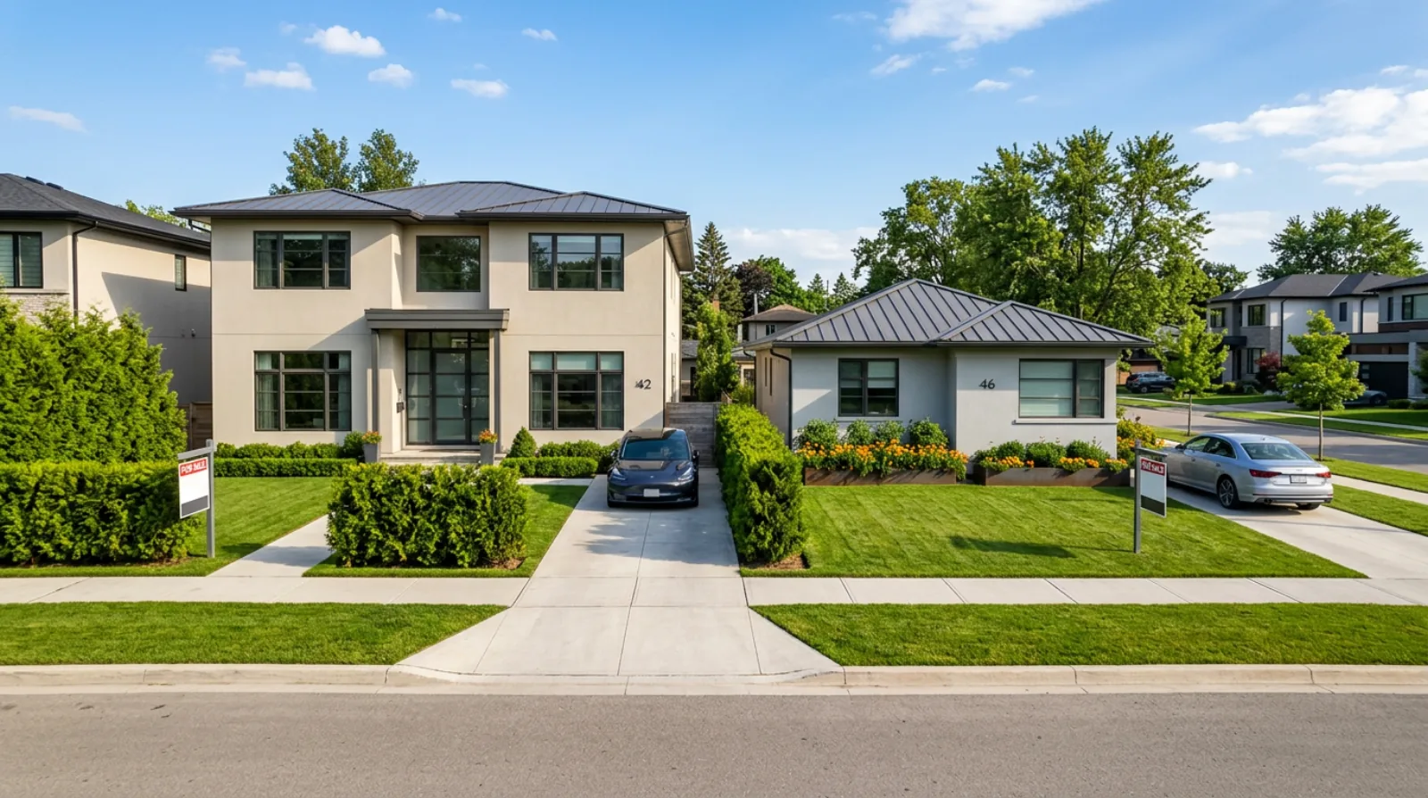
Hero image choice is where the mismatch most often shows. A home page hero of a $3,000,000 custom home on a site where the typical listing is $500,000 sets an expectation the business does not match. A warm "find your first home" header followed by a listing gallery of waterfront estates does the opposite mismatch.
The honest image is the one that reflects the homes a typical client sees. A well-composed photo of a mid-market single family home in the agent's actual market is more credible than a stock luxury shot that the visitor correctly reads as aspirational.
The same principle applies to interior shots, listing photography, and the agent photo itself. The visual tone should match the business as it is, not the business as it is imagined.
The takeaway
A real estate website serves the buyer better when it picks a clear tier and commits to it. The first-time buyer site explains the process and makes the questions easy. The luxury site shows the portfolio and respects the time of the buyer who already knows what they are doing. The mid-market site acknowledges a buyer who has done this before but still needs specifics about the market.
A site built honestly for one tier outperforms a site that tries to be all tiers at once, because the second always makes compromises that the first can avoid. The decision is not about which tier is better. It is about which one your website is actually built to serve, and whether that matches where the majority of your business comes from.
A website rebuild is one way to get the structure right the first time, including the tier-specific content and the right visual direction. The about page and agent bio posts cover more of the content side, and the website checklist covers the structural side.